UH Modular CMS Components
In higher education and other complex content ecosystems, one of the biggest challenges is enabling non-technical staff to keep content accurate and engaging without relying on developers.
Using Modern Campus CMS, I led a modular content initiative at the University of Houston that transformed how content editors build and manage web pages, reducing technical bottlenecks and improving brand consistency at scale.
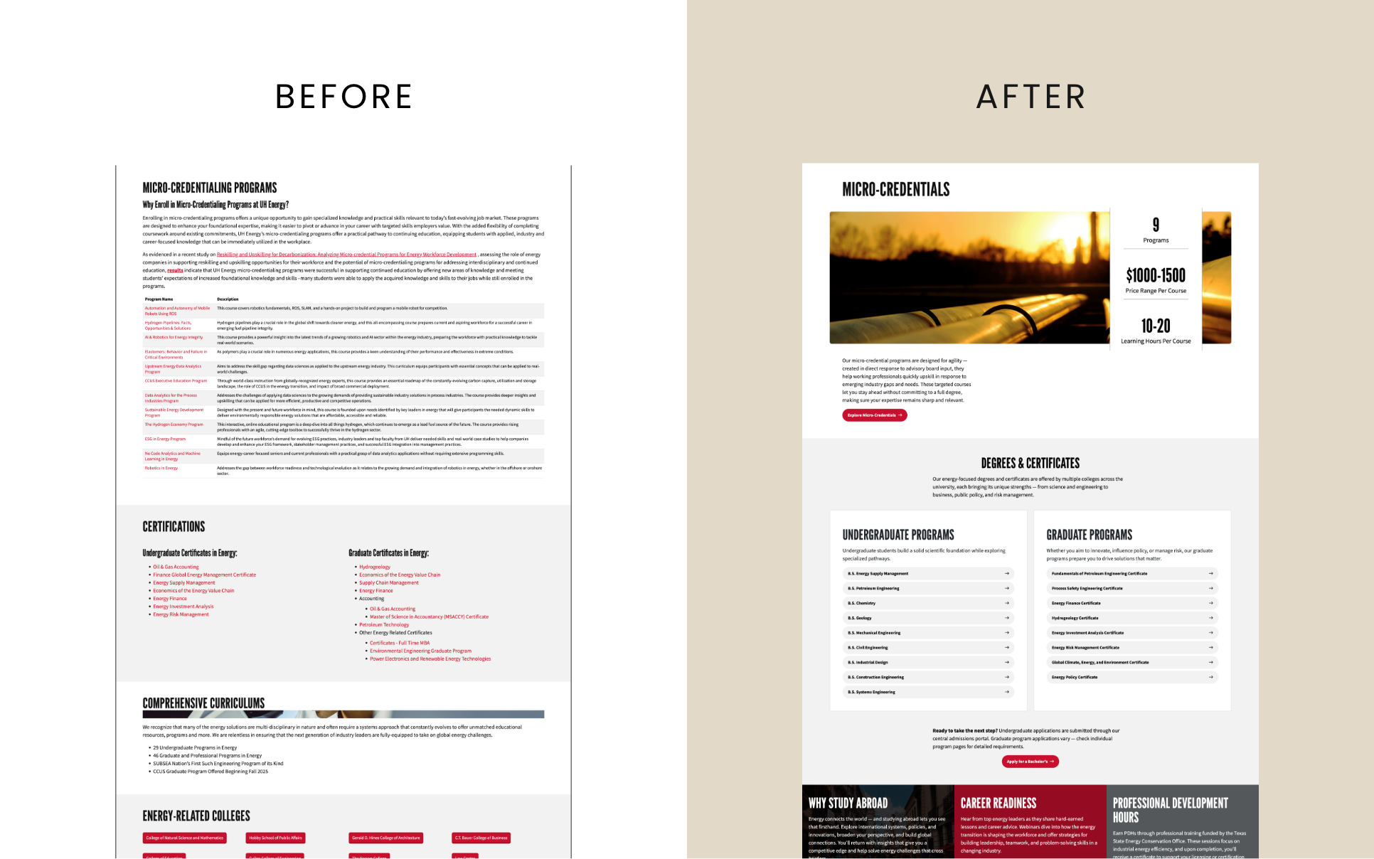
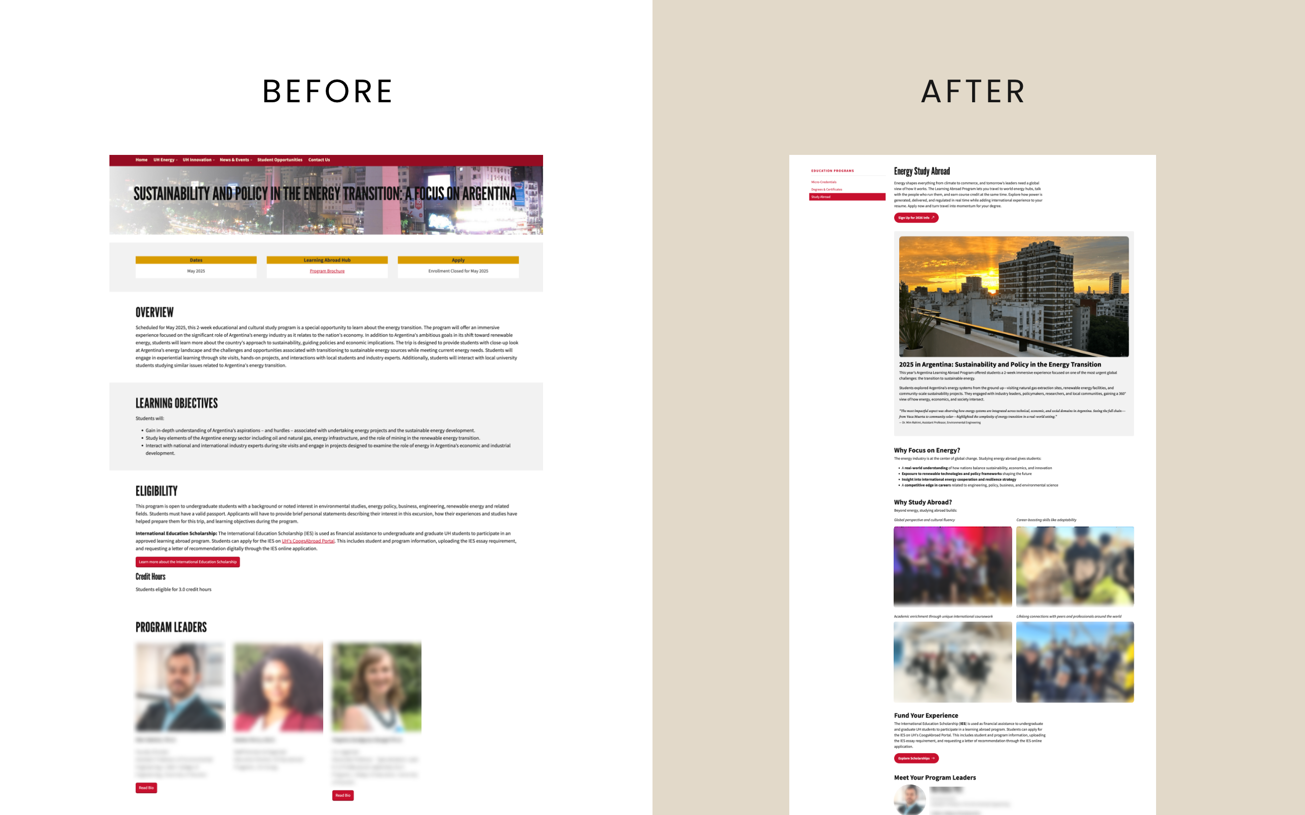
Project Overview
Problem
Our team had recently migrated to Modern Campus using a lift-and-shift approach, preserving the structure and styling of our legacy site. While this expedited the transition, it also meant:
- Many pages remained hand-coded, requiring developer intervention for even small updates.
- Snippets available at launch had limited flexibility, causing layout inconsistencies and sizing issues when content didn’t fit neatly.
We needed a solution that empowered non-technical users to own their content while maintaining design, accessibility, and branding.
Goal
Design a snippet system within Modern Campus that made content editing fast, flexible, and brand-consistent.
Role
As Director of Online Marketing, I led the modular-content initiative, setting its direction, prioritizing editor needs, and presenting the concept to marketing leadership. I mentored the web developer and student assistant, using sketches and drawings to guide component design and working with the developer to translate those ideas into a reusable CMS template.
I designed and developed the button components; the broader library grew through the student’s design explorations and the developer’s implementation under my direction.
Audience
Internal, non-technical subject matter experts responsible for maintaining academic, programmatic, or marketing content across the site.
The Solution: Snippets
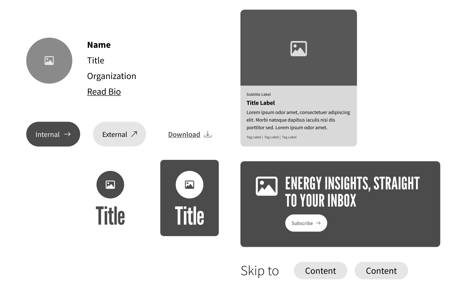
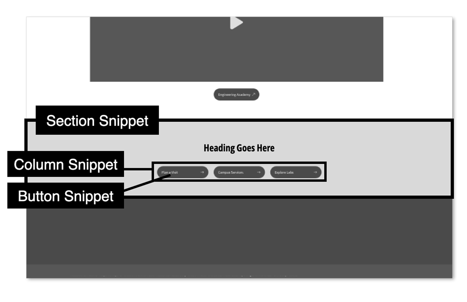
Think of snippets as LEGO pieces for a website: reusable content blocks like accordions, buttons, and cards. Instead of rebuilding each page from scratch, content creators can assemble layouts from pre-built, branded components that fit together.
From Fixed to Modular
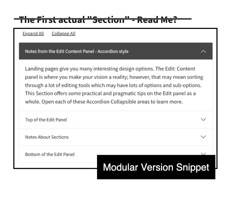
As our snippet library grew, we identified opportunities to give editors more control while retaining structure and standards. We evolved snippets into stackable building blocks, enabling:
- Flexible heading levels for accessibility.
- Multi-column arrangements.
- Custom background colors and alignments.
- Information chunking.
Accessibility & Usability Improvements
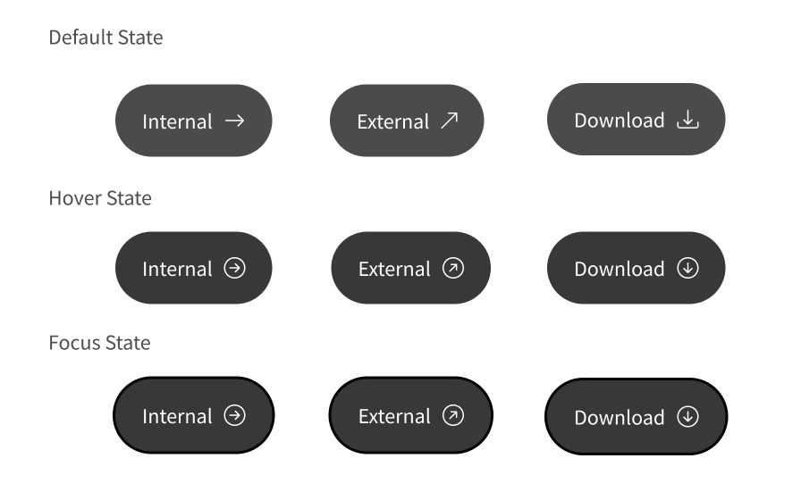
Every snippet was developed with WCAG best practices, with particular attention to mobile usability. I designed and developed the button components with visual indicators to reduce confusion. Each icon communicates what will happen before a user clicks:
- Right arrow for internal links.
- Up-right arrow for external links that open in a new tab.
- Down arrow for file downloads, such as PDFs and spreadsheets.
These symbols make interactions more predictable, helping users avoid unexpected new windows or downloads on limited mobile data.
Hover states and subtle animations reinforce button behavior with visual feedback. The Button Snippet gives content editors a consistent, accessible component without requiring them to write code.
Why It Matters
A full redesign or brand refresh no longer requires hundreds of manual updates. Shared snippet changes can carry through the pages that use them, making the system easier to maintain at scale.