9 Embers Rebrand
9 Embers had grown into more than a development company. The team was supporting churches across strategy, Rock RMS, hosting, websites, mobile apps, and long-term technical partnership, but the brand didn’t reflect their energy and approach.
After a conference in 2025, the team reported a recurring question: what is Embers, and what does it do? That feedback revealed a positioning problem. I recommended making the company’s role as a technology partner for ministries explicit, then aligning the identity, messaging, and website around that direction.
My role: In my role as UI Developer, I was invited to lead the rebrand, working with the owner on colors, positioning, and messaging. I created the updated identity and visual assets shown here, wrote the website copy, and designed and developed the site in Rock CMS, including the “Fueled by Purpose” brand expression.
A Warmer Visual Identity
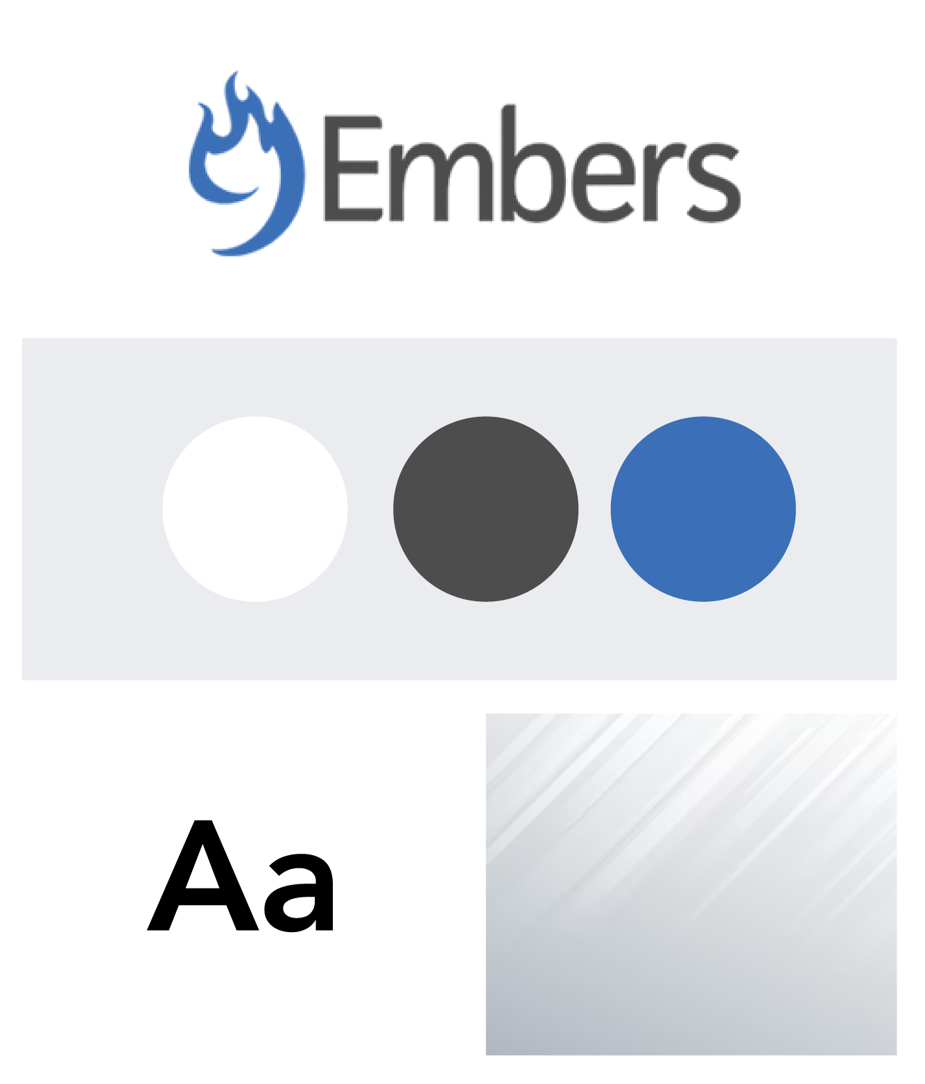
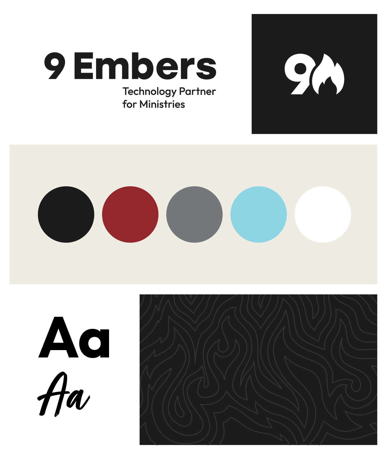
I simplified the visual identity around a clearer 9 Embers mark and developed a warmer palette in collaboration with the owner. The original blue and gray system felt more technical and reserved. The new palette brings in red, bone, black, gray, and blue to create more warmth while still feeling grounded and professional. The updated logo also puts more emphasis on the 9, with the flame becoming a supporting part of the mark rather than the entire identity.
Before
After
Clarity Through the Website
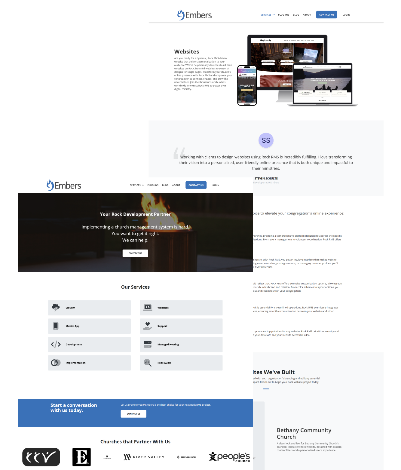
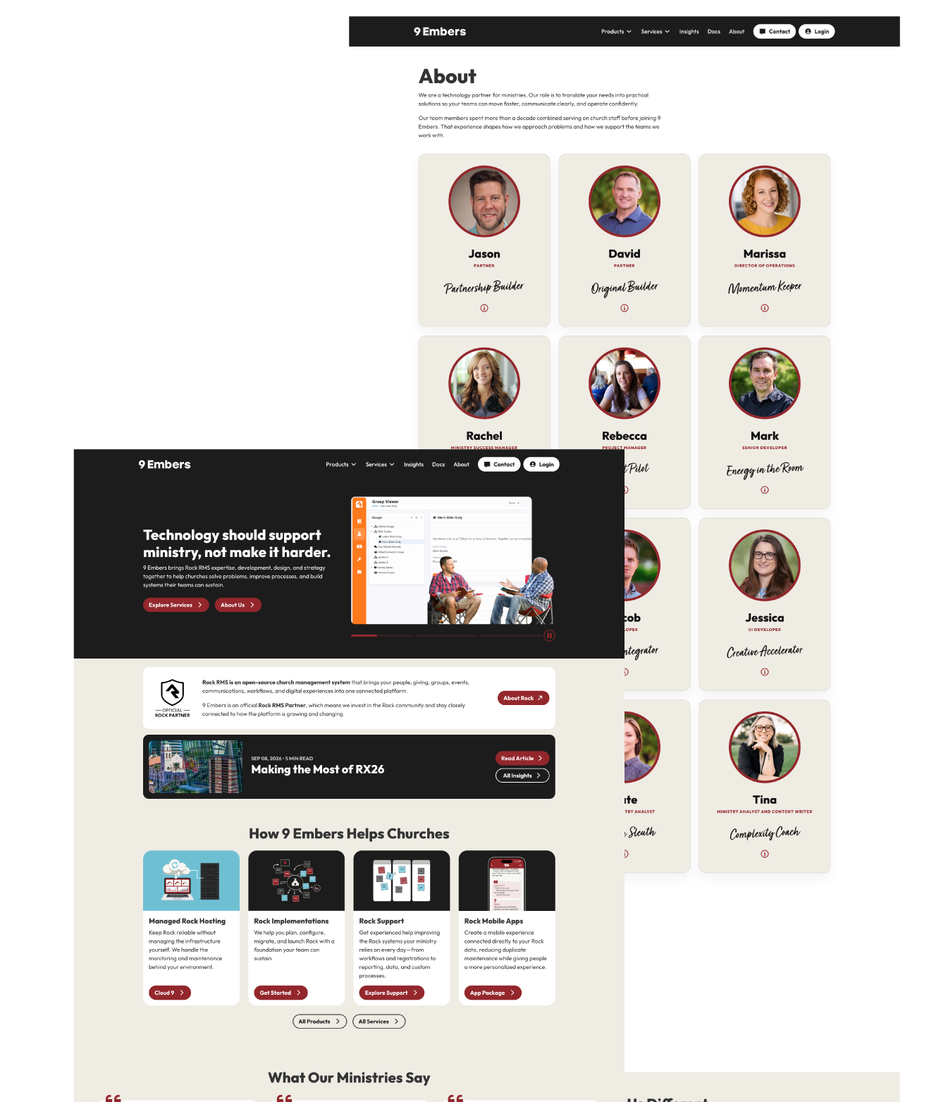
The website became the place to make 9 Embers easier to understand. Rather than leading with a list of services, I rewrote and redesigned the experience around the problems ministries are trying to solve. The new site uses clearer positioning, more specific language, and stronger pathways into services while keeping the focus on practical outcomes.
I designed and developed the site in Rock CMS, giving the brand a working example of the platform and services 9 Embers supports.
Before
After
Adding Personality
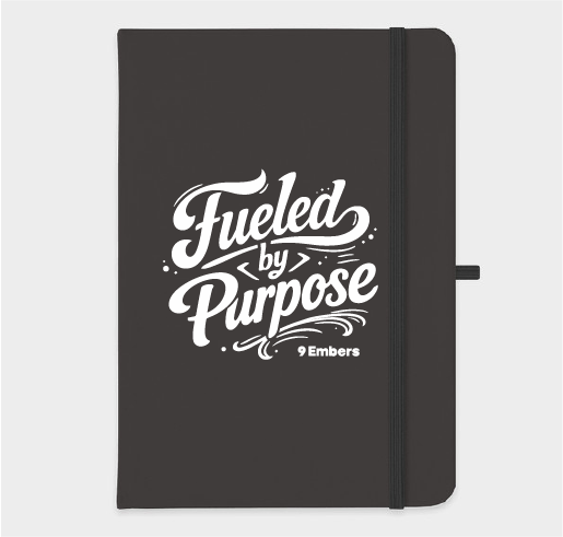
The brand needed a little more of the people behind the work. I introduced Fueled by Purpose as a more expressive part of the identity—something that could live beyond the website and bring warmth to merchandise, print, events, and internal culture. Paired with a more conversational voice and team personality throughout the site, it helps the brand feel less like a technology company and more like the people clients actually work with.