Bearkat Course Website
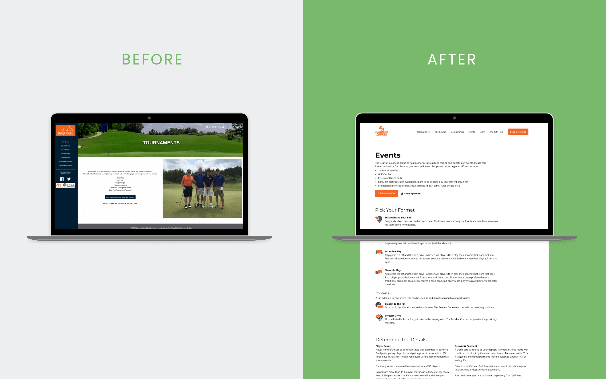
bearkatcourse.com, the official golf course website of Sam Houston State University, launched in October 2021 in support of the rebrand from Raven Nest Golf Course.
Project Overview
Problem
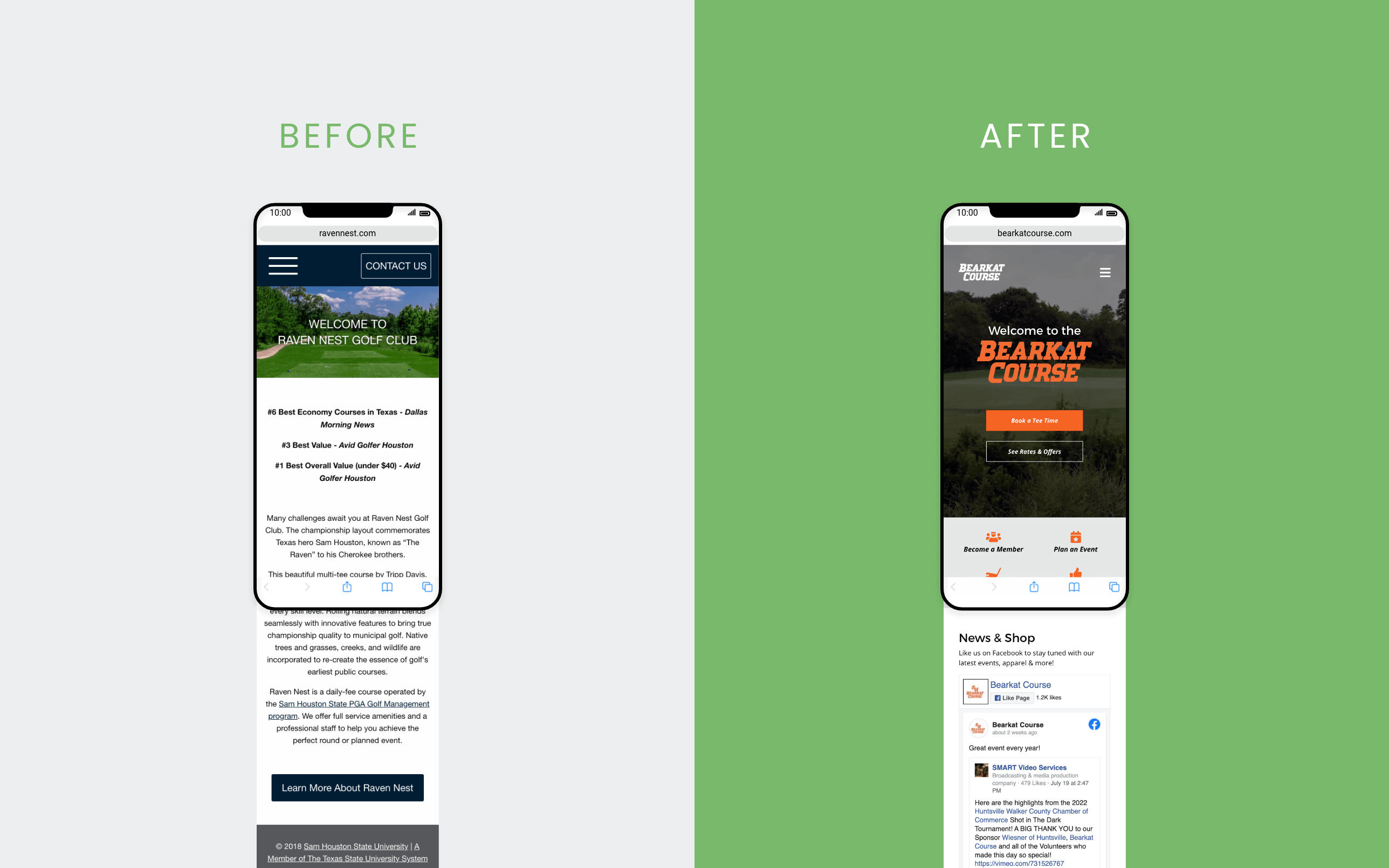
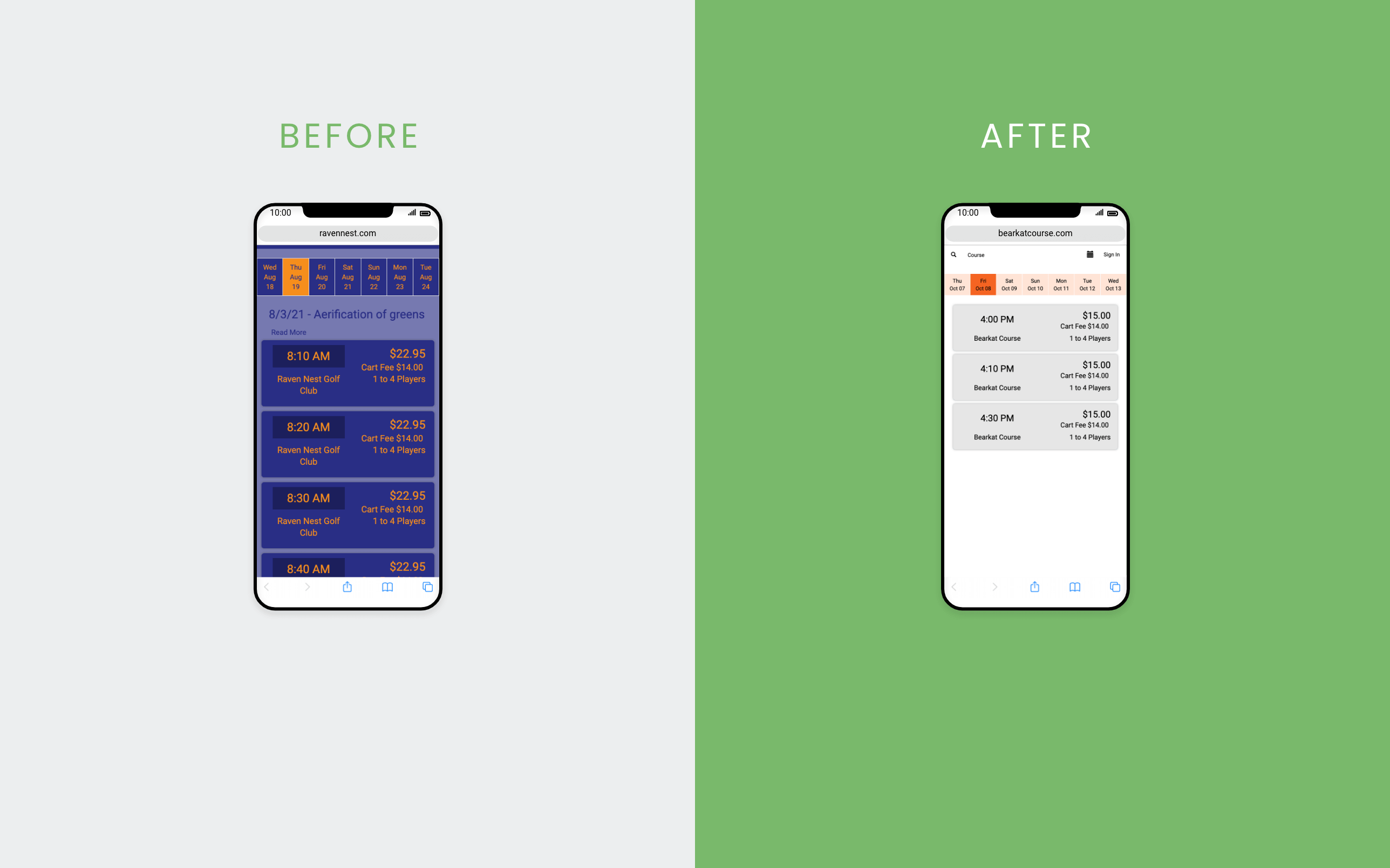
While the course was recognized by multiple news outlets for its value, the website wasn’t showing its beauty. It lacked fresh photos and calls to action to drive revenue. It also clashed with university brand colors and navigational design trends.
Goal
Develop a new website to support the rebrand from Raven Nest to Bearkat Course and increase conversions by driving users to book tee times online, purchase a membership, plan an event, and register for clinics and workshops.
Role
As Web & Media Developer III, I stepped in to support work beyond my usual responsibilities, coordinating the project and handling UX research, design, development, course illustrations, and homepage video editing.
SHSU IT configured hosting and the domain. The golf course manager provided feedback and arranged contractor photography, while Marketing and Communications helped fill content gaps.
Audience
Experienced local golfers, high school students looking to learn, and college students majoring in golf. With the new site design and rebrand, we hoped to also reach less experienced college students.
Process Highlights
Competitor Analysis
With a handful of golf courses in the area, I reviewed competitor sites to identify design patterns and user expectations. Across these competitors, I noticed:
-
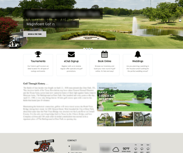
Simple and short content. -
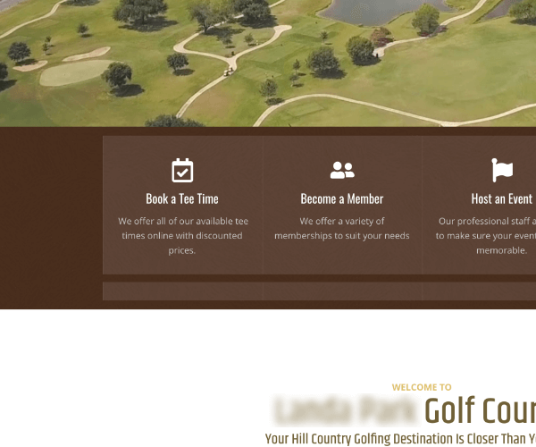
Common calls to action, including “Book a Tee Time” and “Become a Member.” -
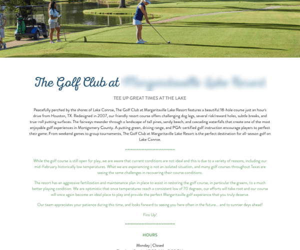
Paragraphs describing the golf course. -
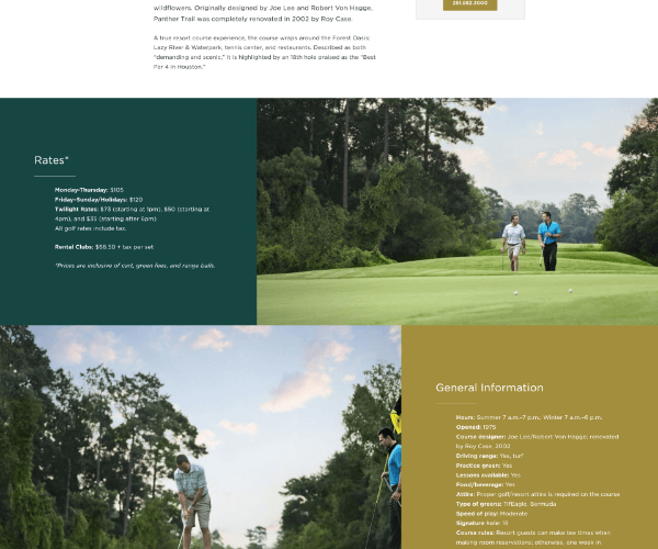
An abundance of course photos.
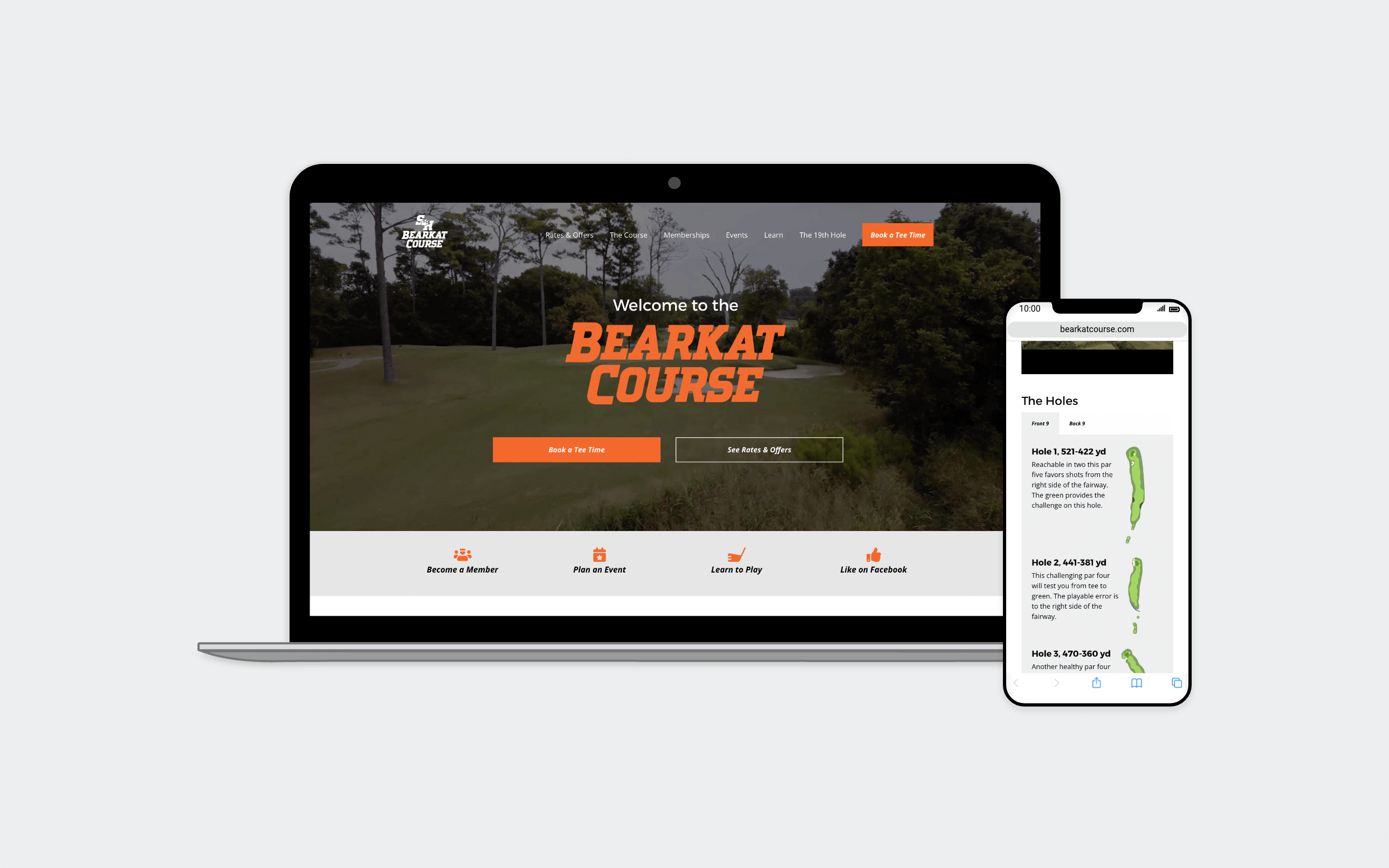
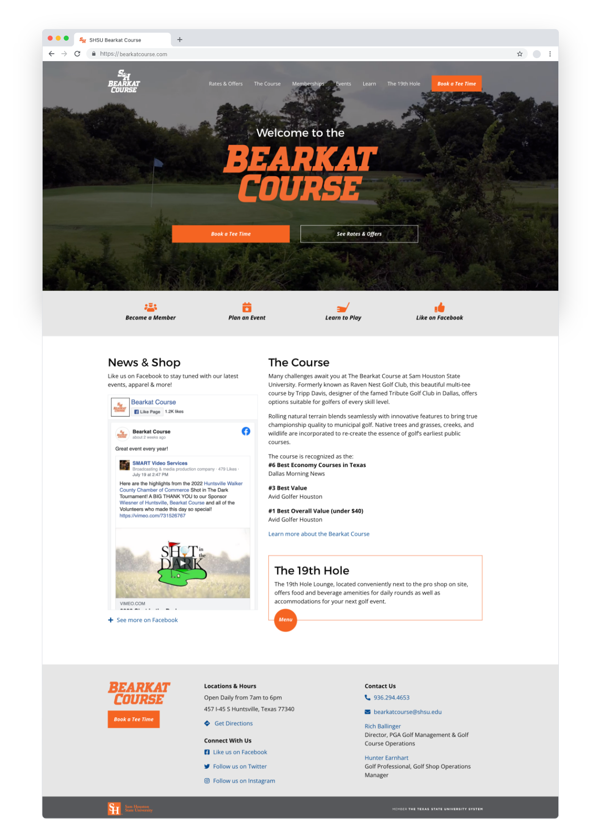
The Bearkat Course homepage features local design patterns, including a brief description of the course, buttons for booking tee times online, and a cinematic video hero of the course.
Content Creation
Content can make or break a project because the design depends on the amount of content available. Often, there isn’t a dedicated resource for creating content. During a content audit, I discovered content buried in PDFs on the old site that could be repurposed for the new site.
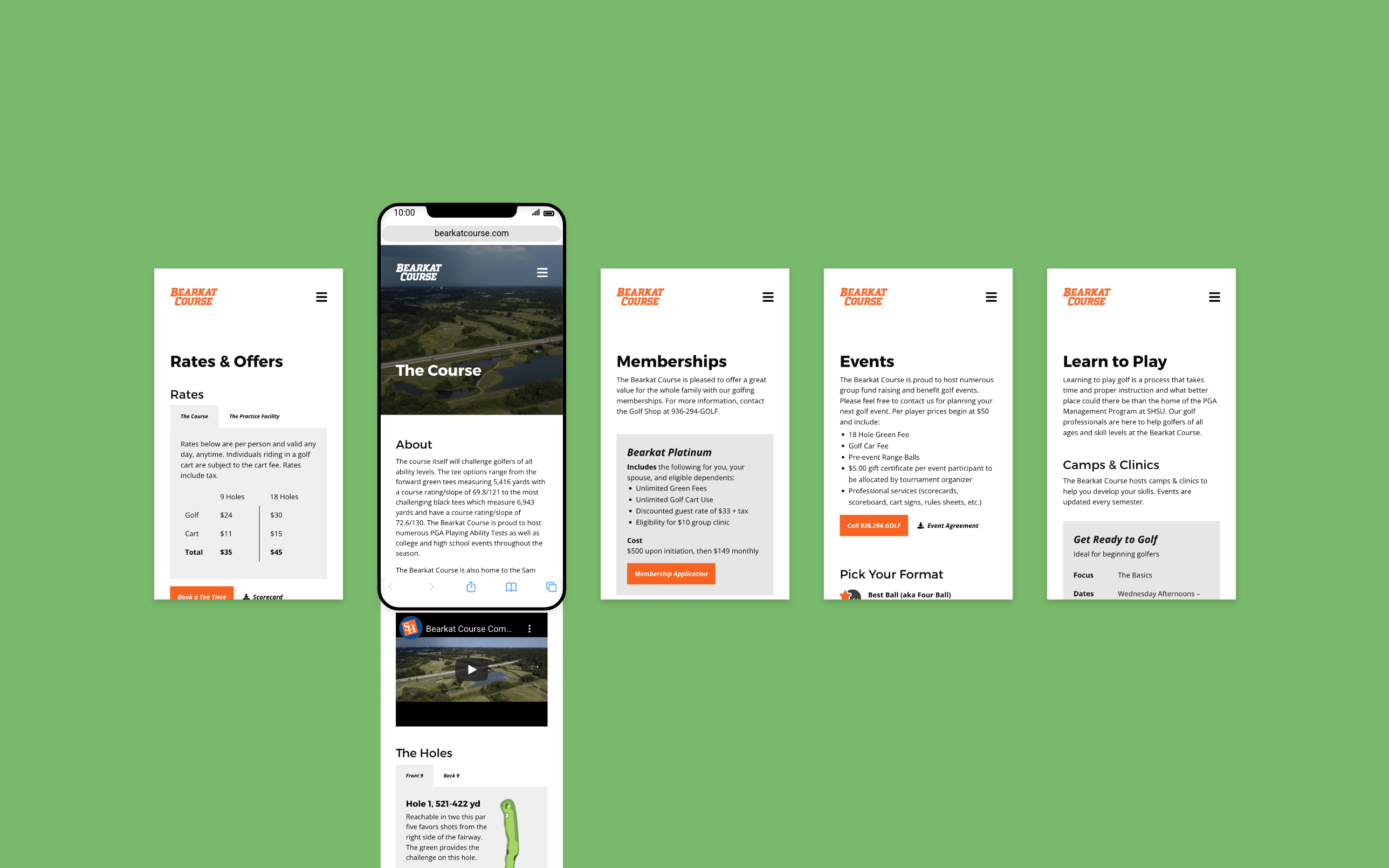
For example, “The Holes” section on “The Course” page was created from an old PDF by rendering the holes in Adobe Illustrator and exporting them individually into web files. The course descriptions were already ready to incorporate into the page.

Front 9 and Back 9: Clearer Mobile Navigation
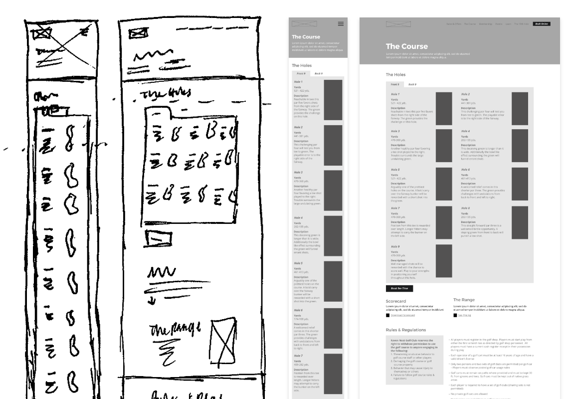
The design process involved sketching to quickly capture ideas, wireframing to test layout options, and prototyping to gather feedback. To display all 18 holes on mobile without endless scrolling, I experimented with different stacking and grouping methods.
I chose Front 9 and Back 9 tabs, drawing on a structure golfers already know. Splitting the 18 holes into two groups of nine reduced the amount of content to navigate at once on mobile and made it easier to explore the course before booking a tee time.