Church Website Migration
Moving a church website from an external CMS into Rock CMS created an opportunity to rethink everyday tasks for members, visitors, and the communications team. In my role as UI Developer, I recommended and built improvements to account navigation, content discovery, and publishing workflows.
The site continues to evolve. This case study shares a few practical wins along the way. The client’s identity and identifying details in the screenshots have been withheld.
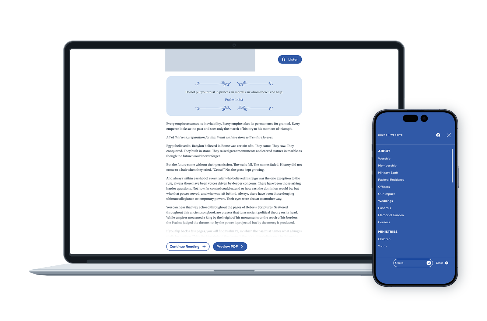
Project Overview
Problem
The migration brought several needs into focus: a predictable home for member tools, more useful ways to find events and sermons, and less repetitive work for the communications team. The church also wanted to help its social media audience take a next step toward connection.
Goal
Use Rock’s connected content and account tools to make the website more useful, while creating manageable workflows that can grow with the church.
Role
As UI Developer, I contributed UX recommendations, interface design, and Rock CMS development. My work included page navigation, content filtering, attribute-driven layouts, and custom HTML, CSS, and JavaScript.
Audience
Members managing their information, visitors exploring ways to participate, people connecting online, and staff maintaining the site and its weekly content.
A Predictable Place for Members
Member tools in one place
Problem
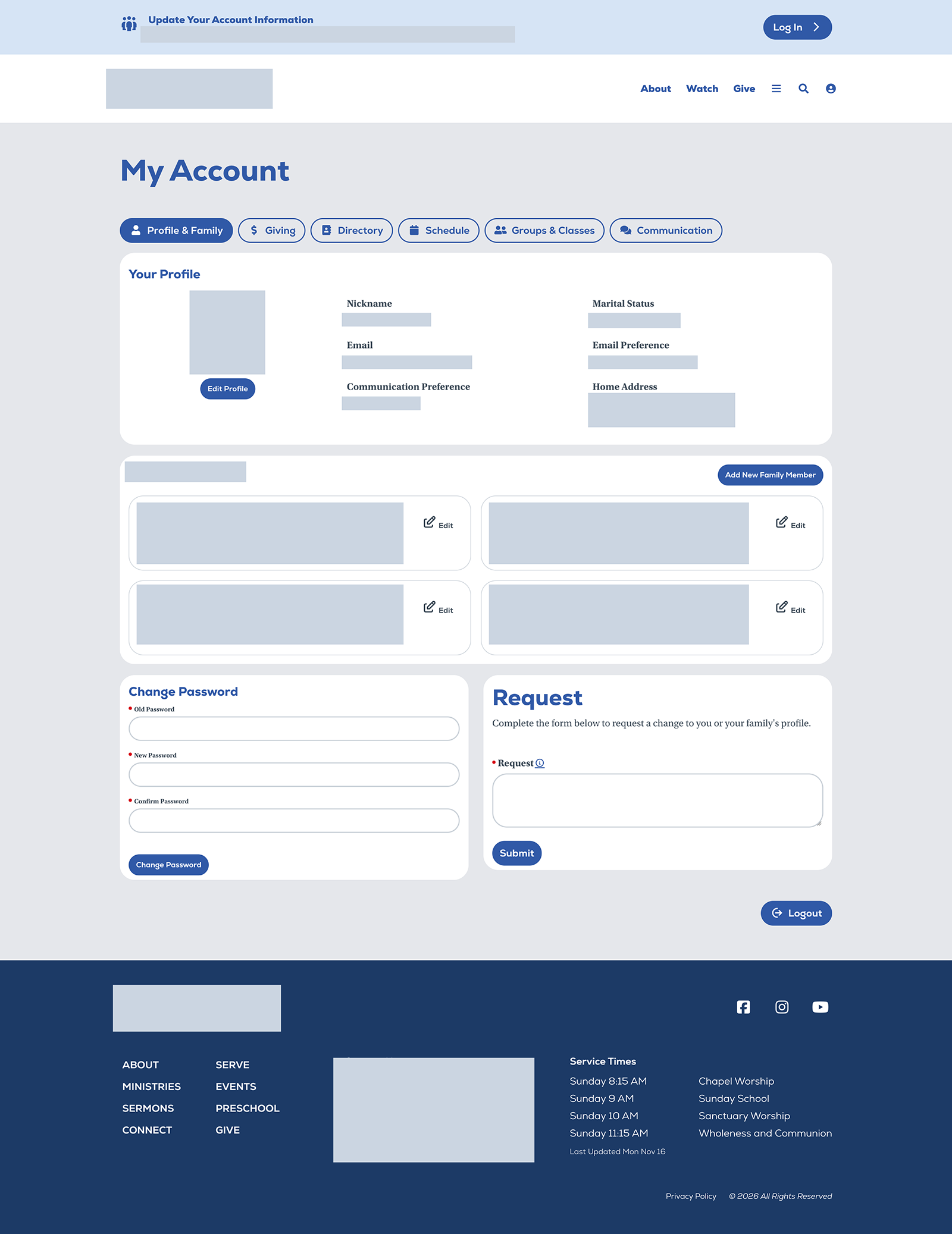
Members needed a consistent way to move between account tools without treating each page as a separate destination.
Solution
I organized the account pages as a portal, grouping related blocks on each page and adding swipeable navigation across the top. I used Rock’s Page Menu block, configured its Page Include list, and used DisplayChildPages to build the navigation.
A directory with appropriate access
Problem
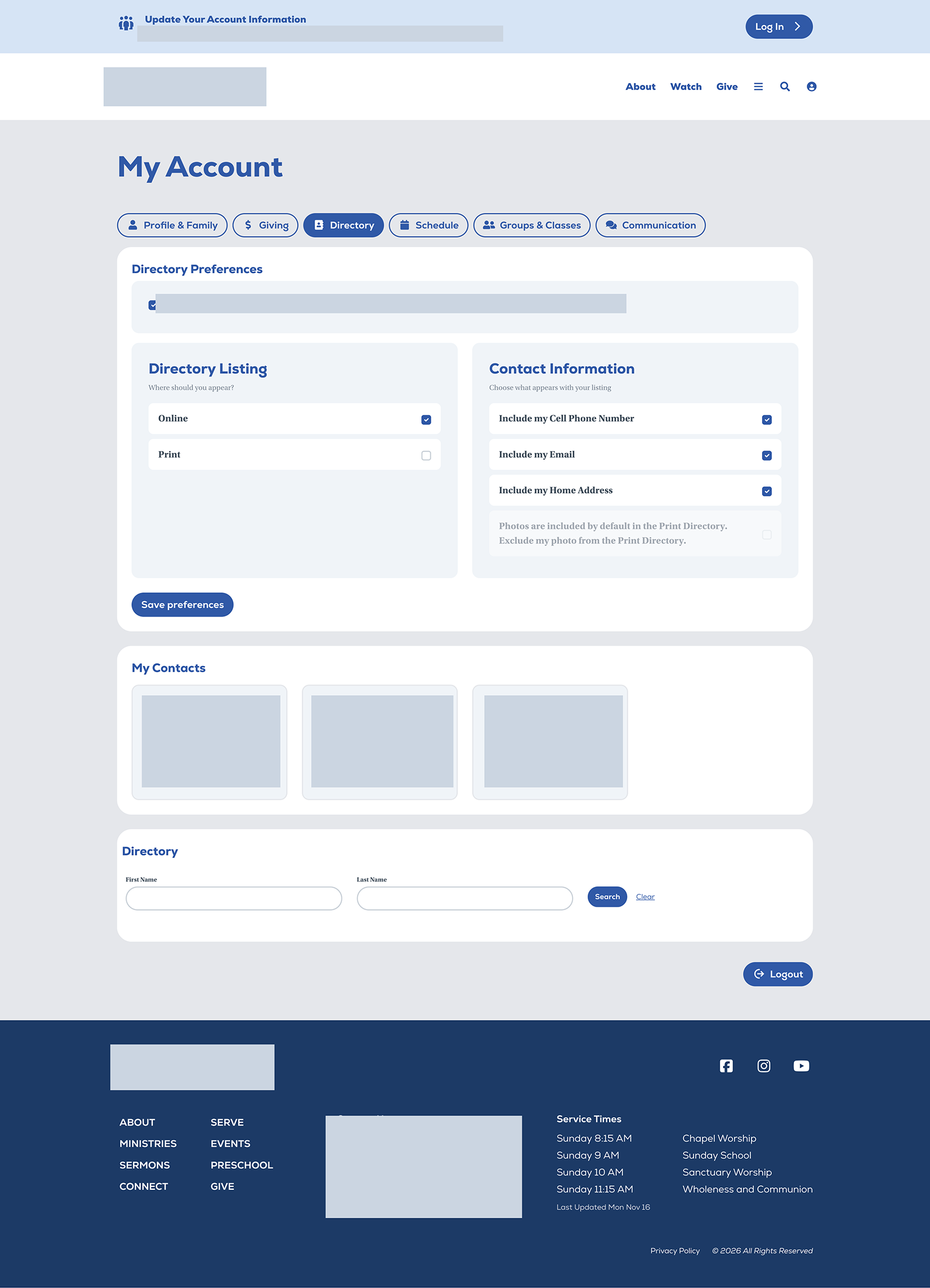
The church requested a member directory that would be easy to locate and available only to the appropriate people.
Solution
I placed the directory under My Account, giving members a predictable place to find it. Access requires a signed-in account and is restricted to adults with a member or staff connection status.
A clearer member login
Problem
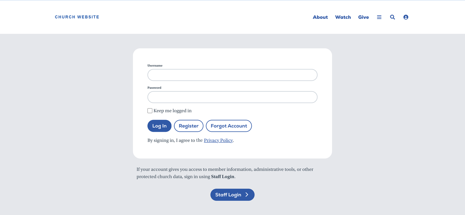
The default login prioritized staff sign-in, creating confusion for members and staff.
Solution
I used Post-HTML on a separate page to provide a member-focused login experience, giving members a clearer entry point to their account tools.
Clearer Paths to Relevant Content
Events filtered around visitor questions
Problem
Visitors needed ways to distinguish who an event was for, who was hosting it, and what kind of activity it offered.
Solution
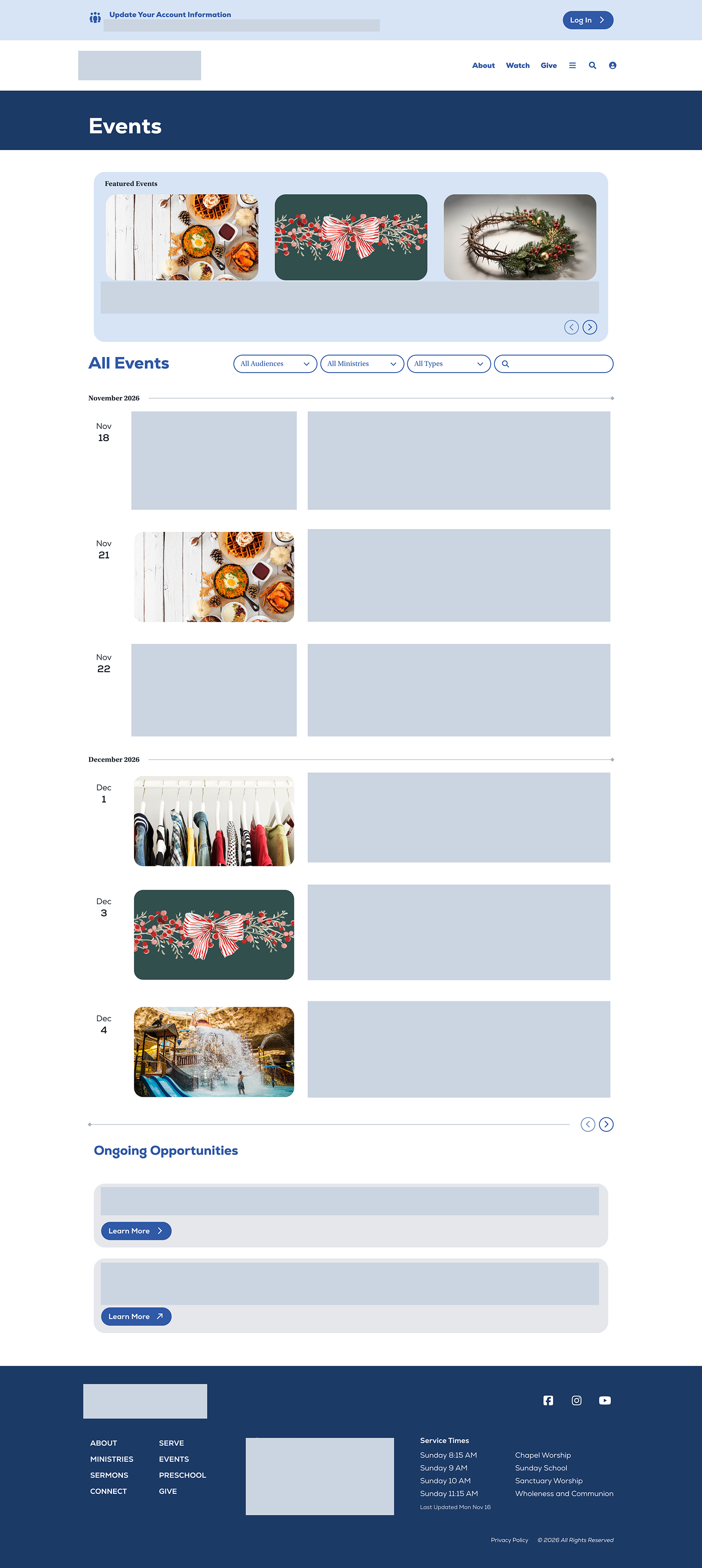
I built separate filters for audience (who is invited), ministry (who is hosting), and type (what kind of activity it is). The options are managed through defined types, giving editors a consistent structure. Event types include Art, Counseling, Faith, Finance, Music, New, Recreation, and Seasonal.
Sermons connected to scripture
Problem
People looking for a message needed to browse by more than its title, including the Bible passage, speaker, or series.
Solution
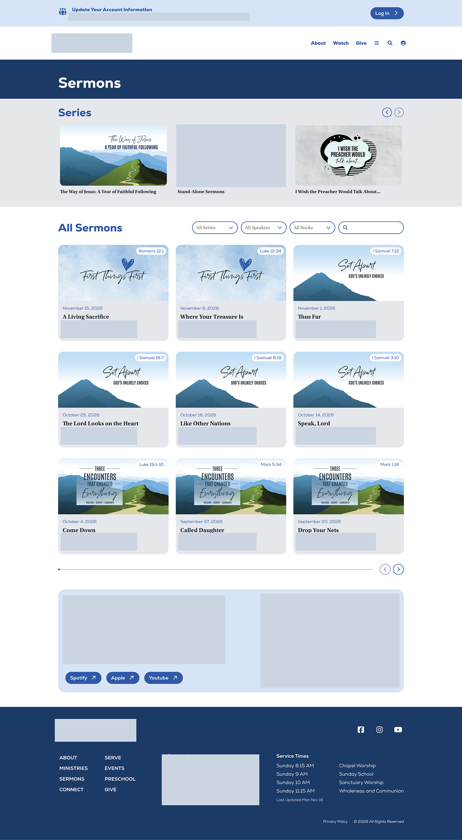
I added Bible-reference filtering alongside speaker and series filters. Reference badges on sermon cards make the passage visible while browsing, and a dedicated verse and reference callout carries that context into each sermon detail page.
A shared visual setting for each series
Problem
The church wanted an immersive series experience that continued from the series page into individual messages.
Solution
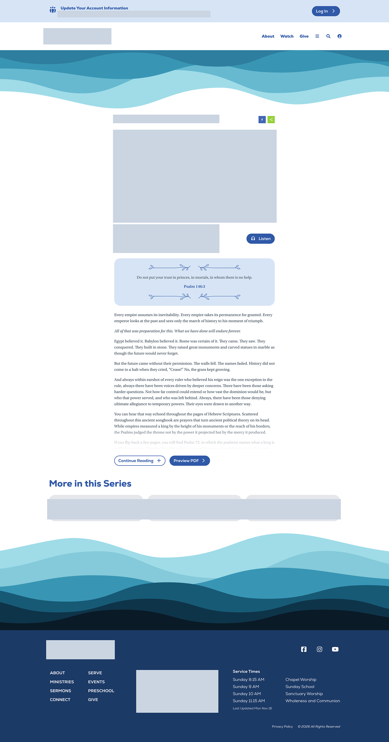
I added header and footer image attributes to message series. The imagery carries through to each message page, giving related content a shared visual setting without requiring editors to rebuild it for every sermon.
More Sustainable Communications
A next step for online followers
Problem
The client described a strong social media presence that was not translating into deeper connection. Remote followers needed relevant ways to participate.
Solution
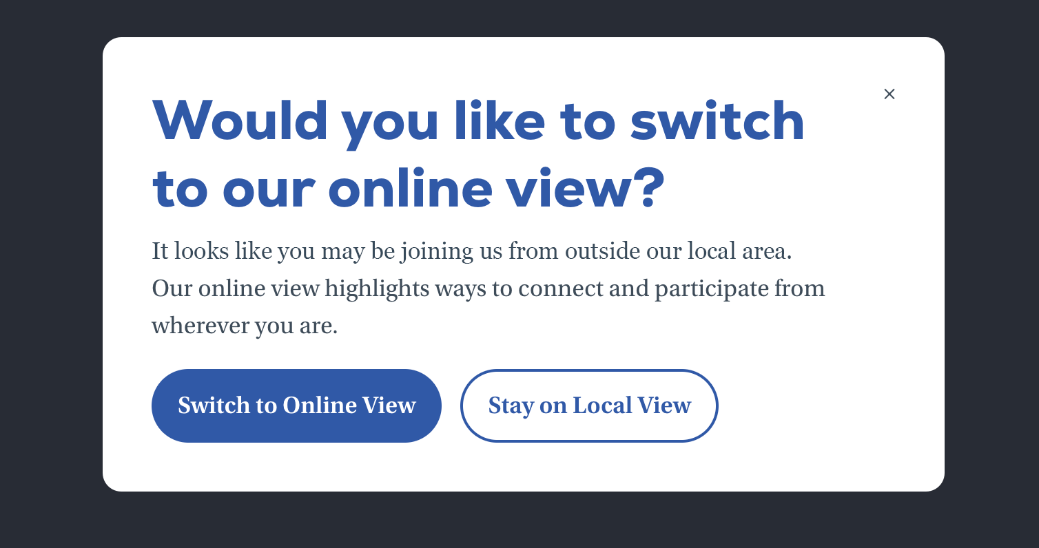
I suggested an online campus experience to help those followers find a sense of belonging. On the homepage, a script uses browser location data, when available and enabled, to offer visitors outside the driving area an online view. Visitors can choose that view and save their preference; the local view remains the fallback.
The communications team can use a URL parameter to preview the online view. This behavior applies only to the homepage. Collecting contact information and communication preferences is a broader goal, creating a foundation for future personalization.
Printable sermons without a weekly layout task
Problem
The graphic designer was creating a separate PDF of the sermon message every week, adding a recurring production task.
Solution
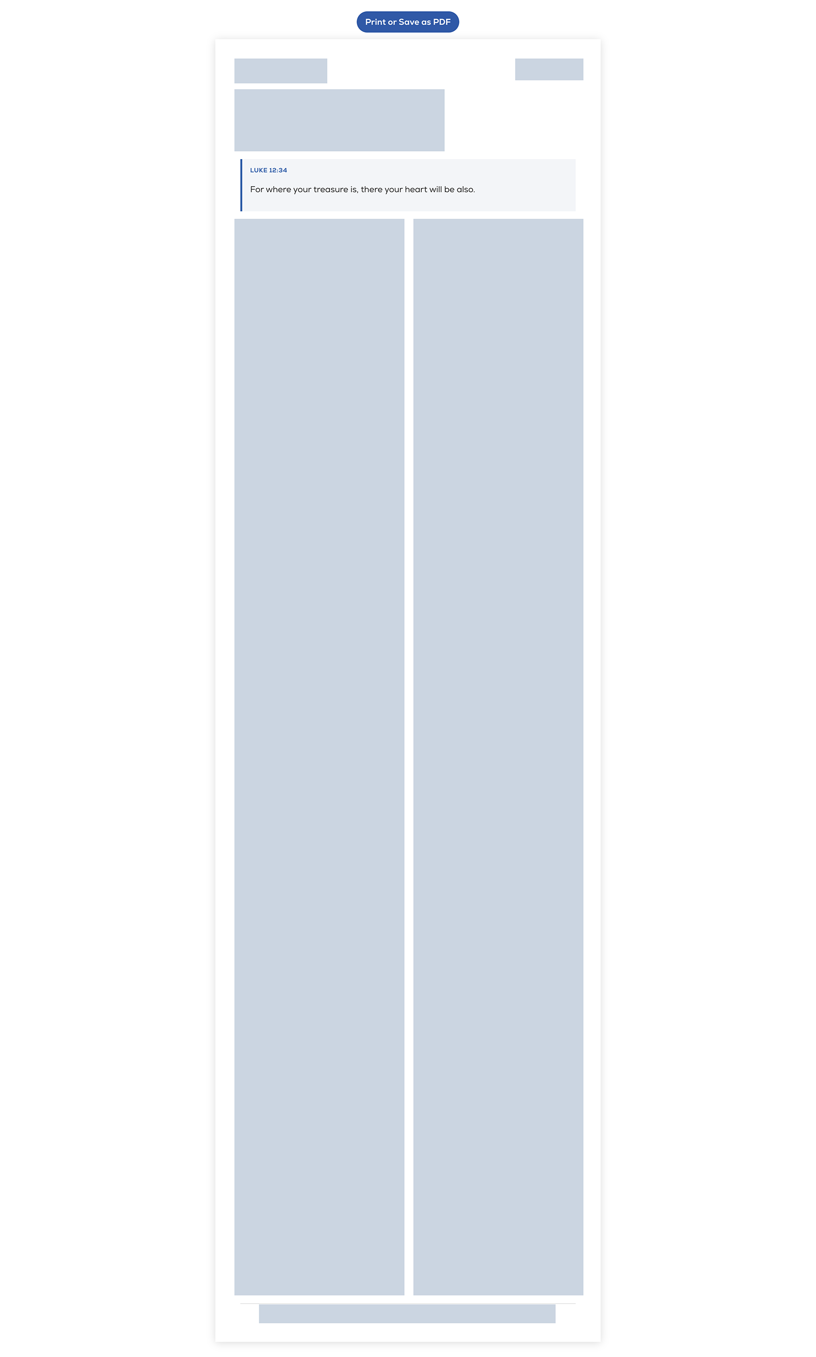
I built a print-friendly HTML layout with CSS and JavaScript. A prompt opens the browser’s print dialog so the message can be printed or saved as a PDF. The reusable layout replaces the separate weekly PDF design task, saving the communications team time.
Service times that follow the schedule
Problem
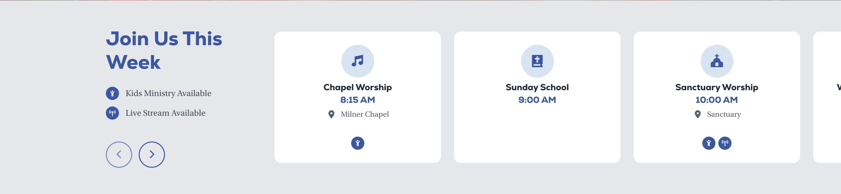
Service times change during the summer and other seasons. Visitors also need to know which services offer childcare or a livestream.
Solution
I built a service-times carousel driven by schedules, with custom attributes indicating childcare and livestream availability. Seasonal changes have a structured place to be managed, and the carousel presents those details alongside the service times.
Early Wins and Ongoing Work
The migration has made room for useful changes: a consistent home for member tools, more specific content filters, reusable series layouts, and fewer manual steps in preparing printable sermons. These are practical improvements to how the site is used and maintained.
The online experience is still growing. Giving followers a clearer place to connect is an initial step; stronger belonging, more personal content, and increased participation remain goals to work toward and evaluate over time.