Bearkat Bundle Logo Concept
The Bearkat Bundle is an inclusive access program, offering students affordable, flat-rate access to required course materials. After creating the program’s webpage experience, I saw an opportunity to explore a clearer, more scalable mark that reflected its student-first mission.
This conceptual redesign was developed during my time at SHSU to explore how the Bearkat Bundle identity could better reflect the initiative’s mission and student experience. While not adopted, it demonstrates my process in evaluating and reimagining existing assets with clarity, meaning, and scalability.
My role: As a UX Developer supporting Auxiliary Services through Business Solutions, I initiated this identity exploration after creating the program’s webpage. The research, sketches, and proposed mark were my work; the concept remained unadopted because it did not receive approval from the original designer, who held brand authority.
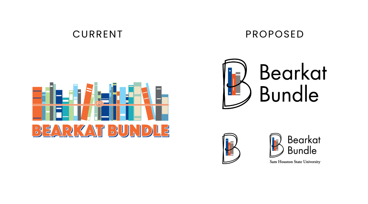
Why Change?
The existing logo presented a number of visual challenges that made it difficult to scale and align with the student-focused messaging of the program.
- Book quantity may unintentionally suggest an unrealistic course load, which could be refined for better clarity.
- Complex compositions can present challenges for logo clarity and reproduction across sizes.
- Books appear loosely stacked and leaning, despite being bound by a rope.
- Some elements suggest a shelf rather than a portable bundle, which may dilute the visual metaphor.
- A broad color palette adds vibrancy, but may impact focus and scalability at smaller sizes.
- Fine details like the rope don’t hold up at small sizes.
The Solution
In 2021, I proposed a modern, minimal logo built for clarity, scalability, and meaning:
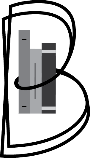
- Double-layered B: Stylized to suggest both “Bearkat” and “Bundle.”
- Page-turn symbolism: The rounded forms of the Bs curve like flipping pages.
- 3 simple books: Positioned between the arches of the B, directly referencing the realistic bundle size.
- Circular motion: The interlocking Bs form a loop, reinforcing the concept of inclusivity and continuity—foundations of the program’s value to students.
Design Process
-
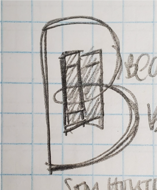
1. Sketch ideas -
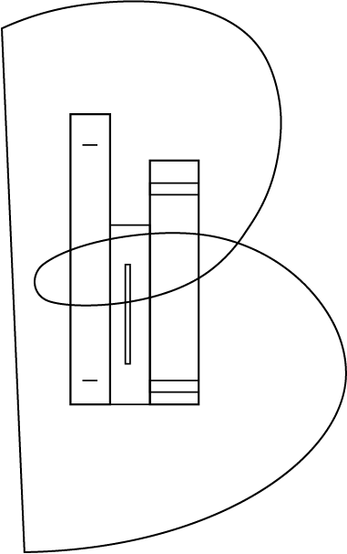
2. Render the outline -
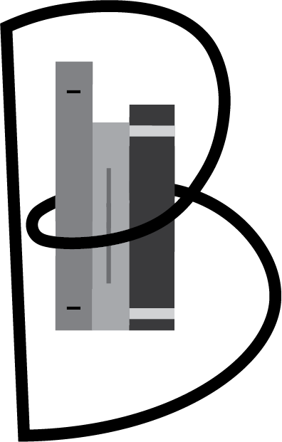
3. Experiment with weights -
4. Explore layering -

5. Experiment with color
Mark Usage
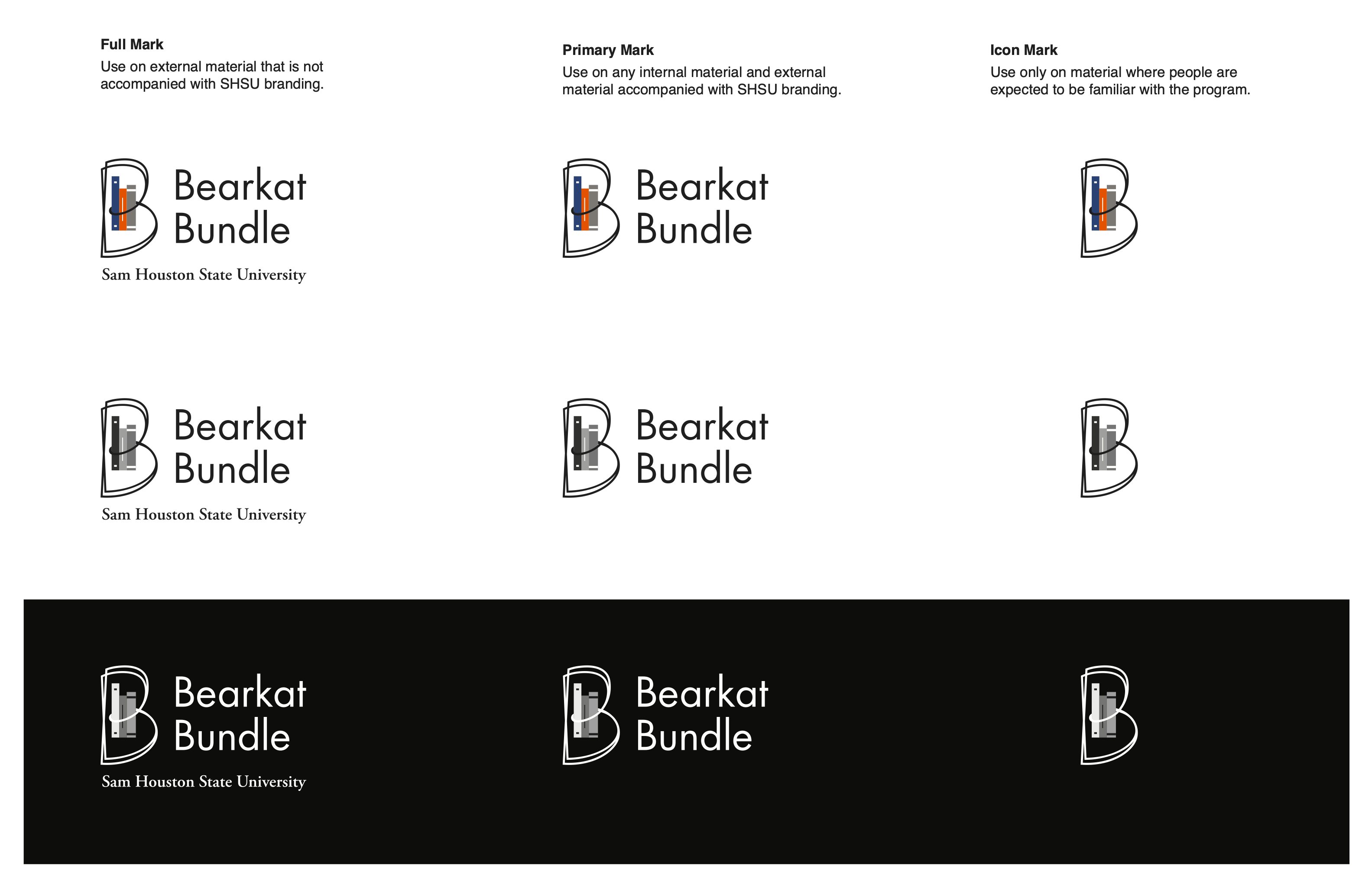
- Full mark
- Includes the university name. Use on external material that is not accompanied by SHSU branding.
- Primary mark
- Use on internal material and external material accompanied by SHSU branding.
- Icon mark
- Use only on material where people are expected to be familiar with the program.